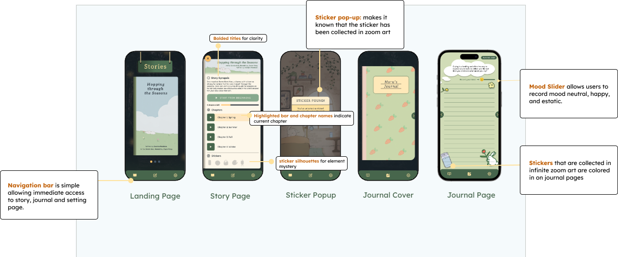
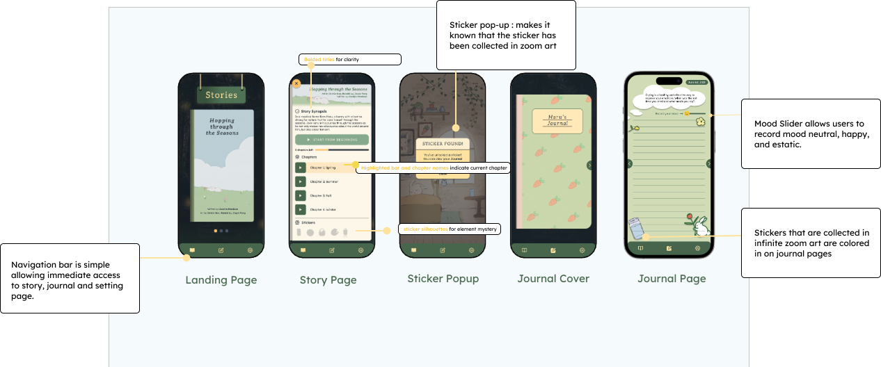
Color + Accessibility
We chose warm tones like yellow and orange to create a cozy, welcoming atmosphere.
Various shades of green were used to evoke a sense of calm and reflect natural environments.
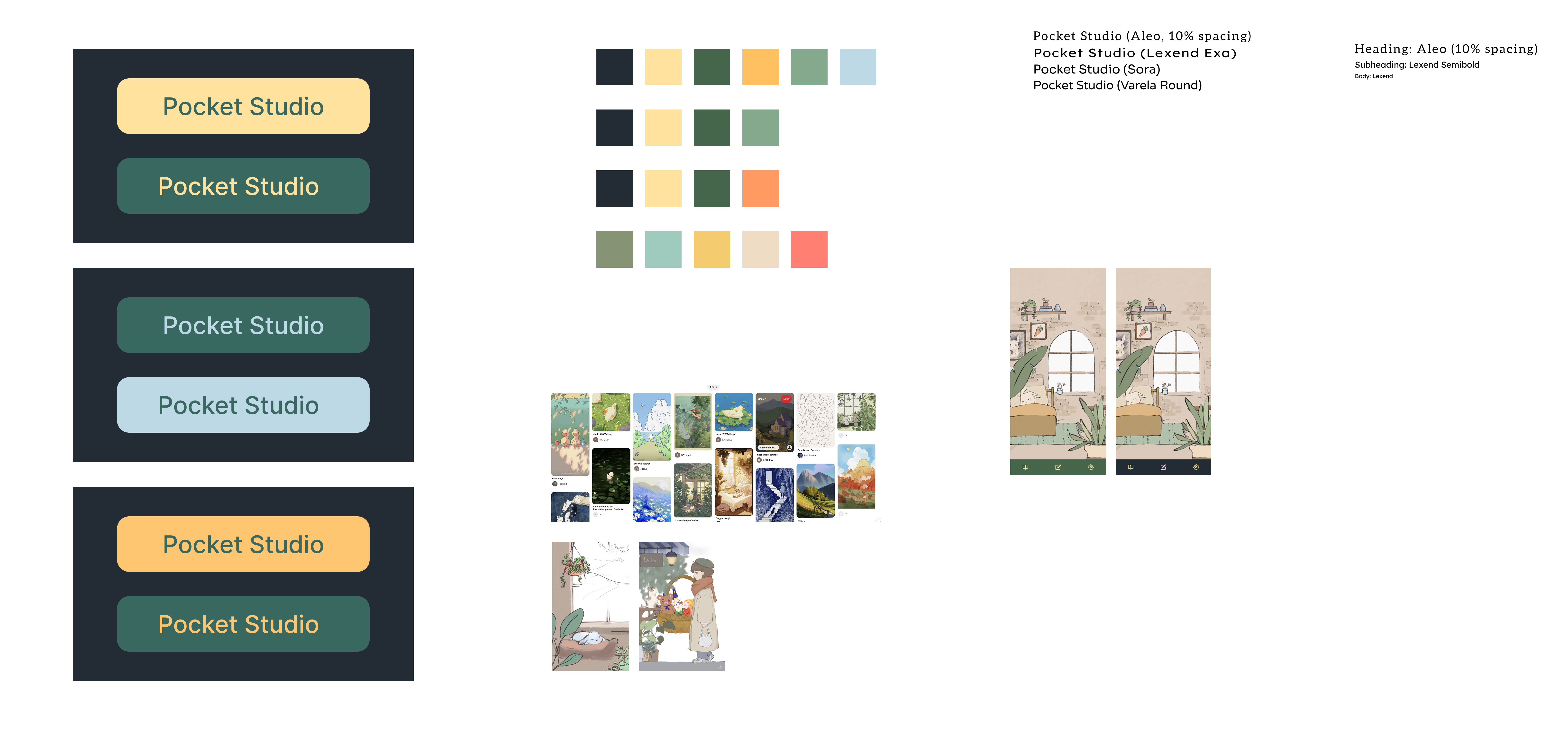
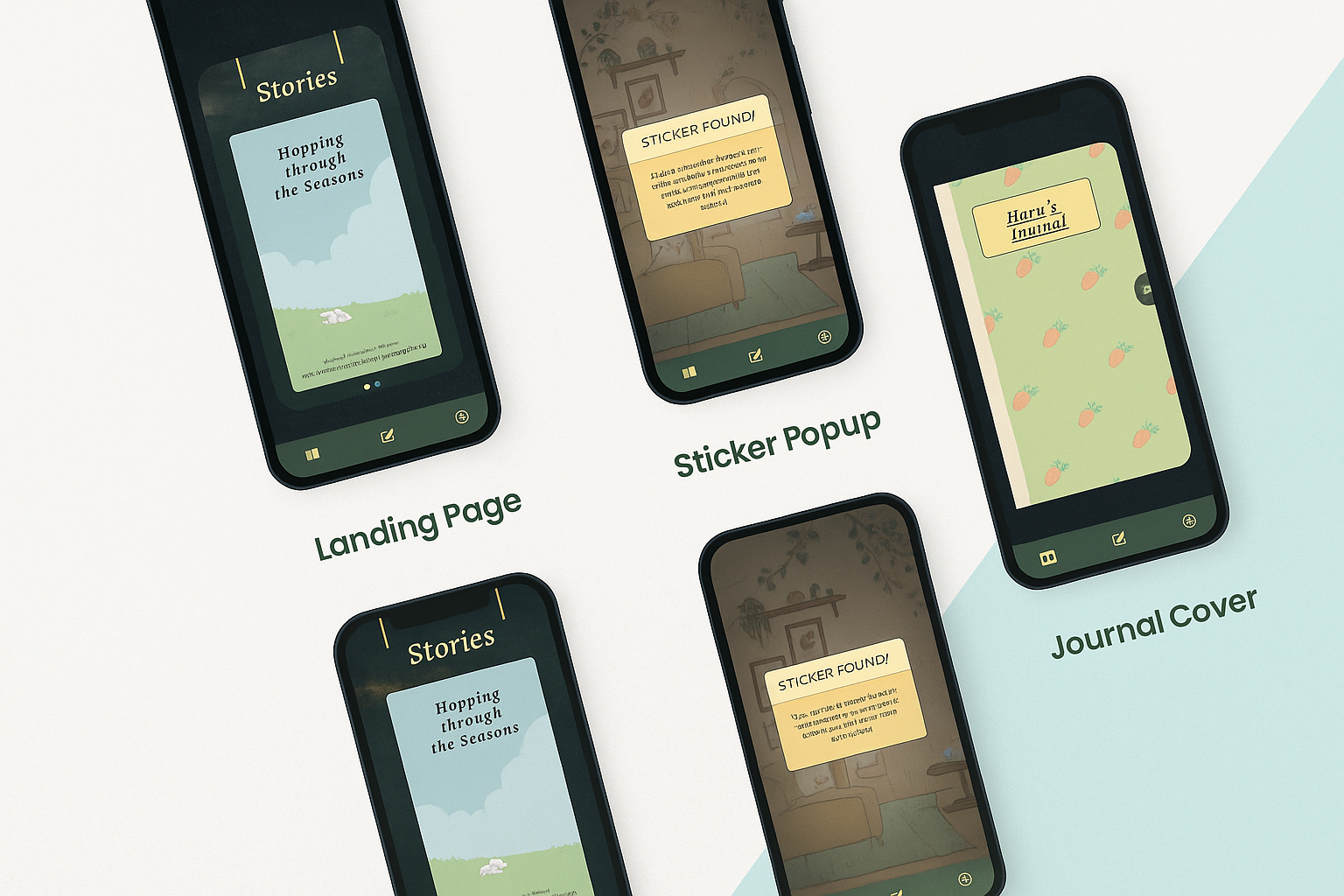
⭐️ The palette ties into the narrative, as the main character, Haru, is often surrounded by nature.
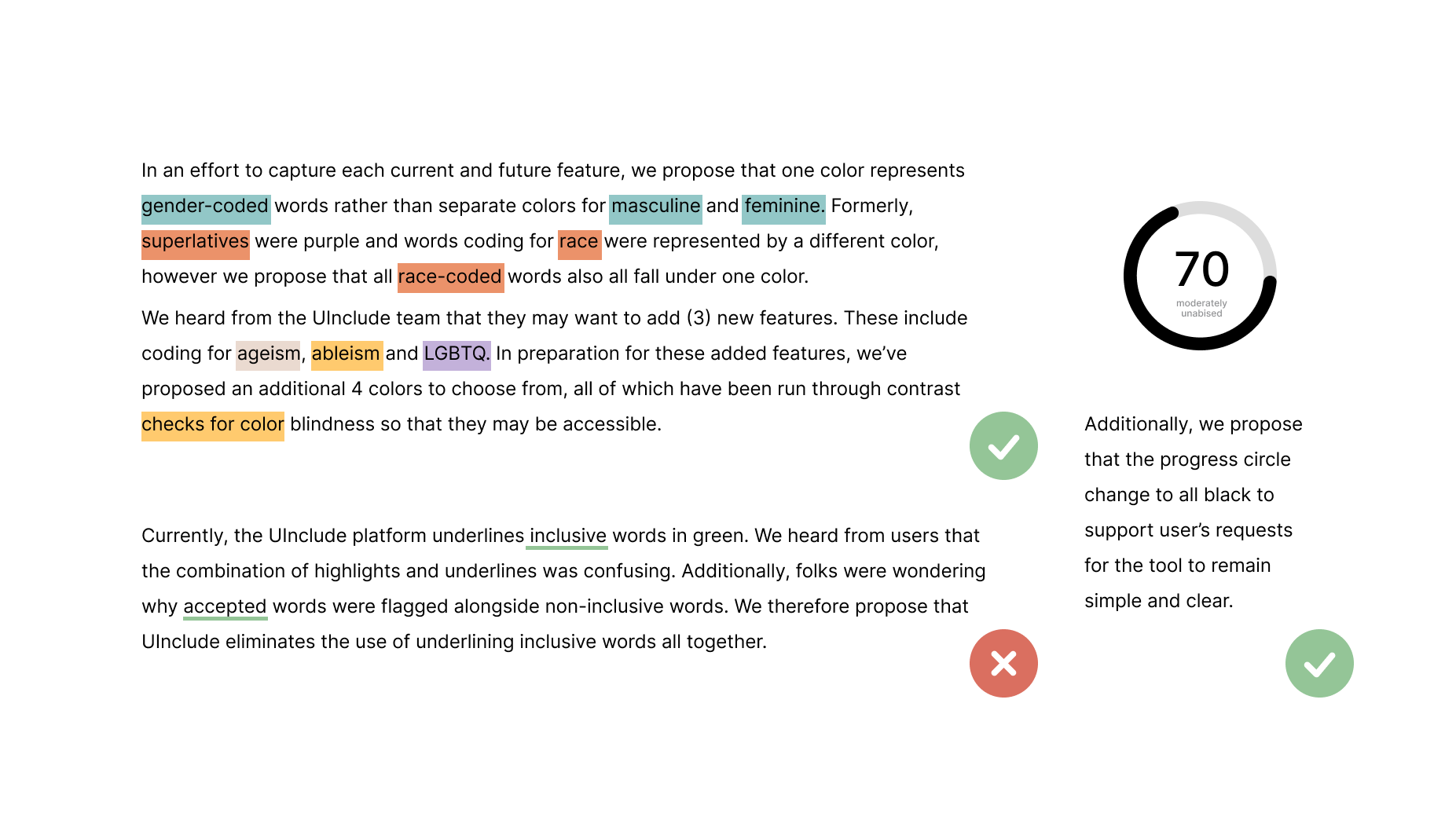
We also suggested the above revisions to the UInclude color strategy:
• Integrating the 7 new colors into the biased word highlights.
• Removing the green underline that indicates inclusive language (this was confusing according to many beta testers of the tool).
• Revising the Inclusion Score wheel to a black and white design so as not to conflict with the colors used in flagging words in the text editor.
.png)